Providing more value and convenience to members by rethinking how the web fits into the whole customer lifecycle at this disruptive budget gym chain.
Involvement: UX Design, UI Design, Design System.
Team: Jordan Dobney (Research, UX Design), Warren Challenger (Research), Lex Lofthouse (UI Design), Drew Garratt (Front-end), Leo Gumbo (Back-end).

Background
The mission for Xercise4less is to make fitness more affordable and inclusive. With gyms located across the UK and flexible membership plans, they’ve grown rapidly by attracting a broader audience. To support that expansion, they recognised the need to overhaul their digital experience, improving the journeys from sign up to work out so members got more value from the proposition.
The central problem was fragmentation. Several apps and websites had been patched together, creating a disjointed user experience of jarring transitions and inconsistent messaging. Managing the system was obviously a struggle, with the Xercise4less team unable to match the agility of competitors when evolving their content and offering.
We had to create a one-stop shop, bringing together the various pieces of data and services in a coherent and usable manner.
Challenges
- Parts of the development were being carried out by our direct colleagues, and the rest by the client’s various in-house teams.
- We had to do most collaboration, presentation, and feedback remotely with people in the UK and abroad (way before COVID lockdowns).
- Flexibility had to be baked into every aspect of the design so Xercise4less would be free to adapt their offering.
- The scale of the task increased further when considering variants needed for the likes of registered members and customer support.
- Conflicting business priorities meant requirements shifted so we needed clean-up sprints to backport and refactor designs.
Discovery
To grasp the sprawling ecosystem, we needed to consult with several departments at Xercise4less. I used a stakeholder survey to understand the role each person played and their perspective on the project strategy. This informed the agenda for a day-long design workshop facilitated by my colleagues Jordan and Warren.
They started with an activity to write simple proto-personas that described the goals, motivations, barriers, and top tasks. From this, the primary journeys were identified and mapped out, step-by-step, with teams brainstorming the existing pains and opportunities to improve. Extra attention was paid to registration and account management, which Xercise4less were most keen to optimise.


We interviewed existing members in-person at Leeds and Nottingham gyms, asking them about their motivations, gym usage, and digital behaviour. This was complemented by quantitative data from a large customer survey and analysis of the membership database, which provided insights on product ownership, gym attendance, and churn.
This research allowed us to develop a series of more specific personas whose circumstances turned out to mirror different elements of the Xercise4less offering, for example:
- People on irregular income, such as students and the unemployed, appreciated packages that had extra flexibility and no penalties.
- There were a surprising number of retirees who used the gym as a social venue, attending with a handful of friends.
- Free classes and private zones were a draw to women who wanted a safe and inclusive place to maintain their fitness.
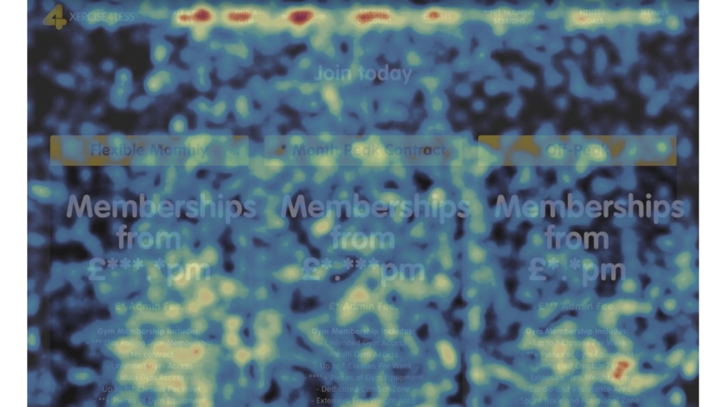
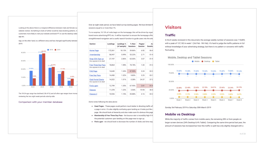
We conducted further assessment by reviewing site analytics, watching Hotjar recordings, and evaluating UX heuristics. Bringing everything together, the suspected issues were validated and expanded upon, underlining the need to consolidate the digital experience:
- New visitors often got lost in the labyrinth of marketing pages which also put SEO needs ahead of answering common questions.
- There were several difficulties when people were converting an account from a free trial pass to a paid full membership.
- People struggled to understand the differences between membership packages despite having only a few options to compare.
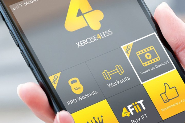
- Most members didn’t use the app and got frustrated that common tasks like booking classes weren’t available on the website.
- Other gym chains had richer digital services, so people who switched to Xercise4less had higher expectations to meet.
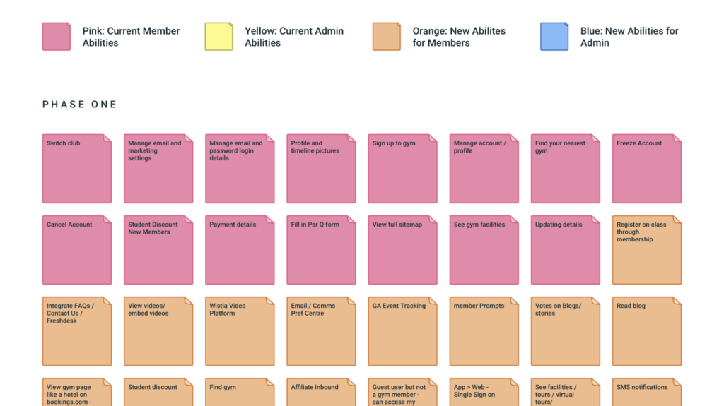
We concluded the discovery phase with a workshop to establish a product roadmap for the new site. With the main stakeholders, we worked through over 200 items relating to 50 different user tasks. These were organised into themes (e.g. marketing, support, admin) and prioritised with consideration to the business and user needs we’d exposed.
Solutions
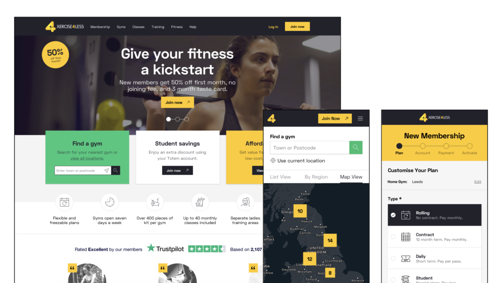
With so many pieces of content and functionality to integrate, it made sense to start by redesigning the site architecture. I sketched a simple map of the customer lifecycle, plotting researched thoughts and actions against the stages, followed by the corresponding pages and flows. I used the groupings from this to draw up a sitemap which allowed me to discuss content strategy and SEO requirements with the client.
The navigation had previously been owned by marketing, who largely used it to merchandise offers, whereas I looked to prioritise starting points for user intent. Because the majority of traffic was mobile, I gave extra consideration to the use of progressive disclosure and the drawback of links being “out of sight” — so for small screens, I included an abridged navigation bar alongside the usual slide-out menu. Simple labels were drawn from customer vocabulary.

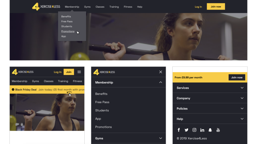
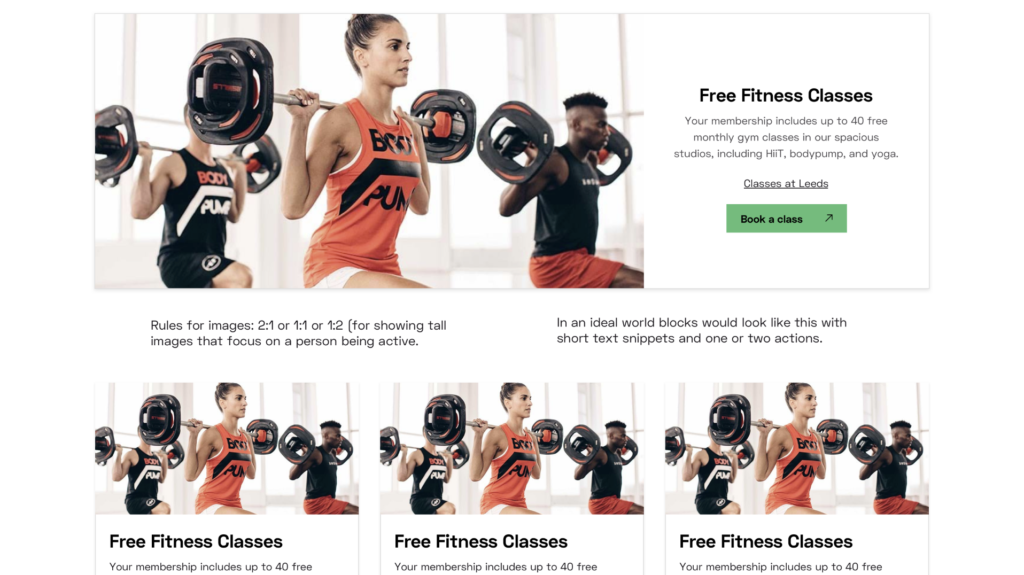
As the sitemap and wireframes were iterated, the scale of the site became more apparent: over 150 different screens, with dozens of UI components, and multiple states to convey. To help improve efficiency, consistency, and collaboration in this scenario, I recommended building up a design system.
My colleague, Jordan, had produced style tiles to define a new visual language. Sampling this provided the base brand variables. I then conducted an audit of the existing site and new wireframes to take inventory of the blocks and elements that would be required. This was all set up as a Sketch library, served through Abstract, that designers could draw from and expand as the project progressed.
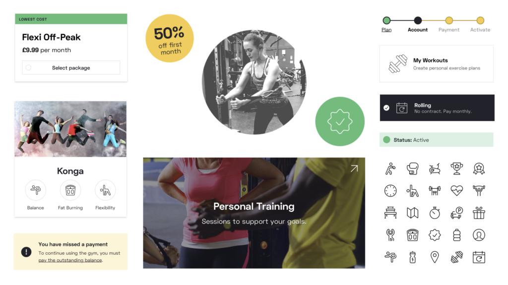
Site authors at Xercise4less embraced the systematic approach, seeing it as an opportunity to enhance their page building toolbox. I incorporated their “dream” blocks and provided a series of UI guidelines and layout specimens to demonstrate what they would be able to achieve. Invision’s Inspect and DSM tools were used to document the system and hand-off to developers.
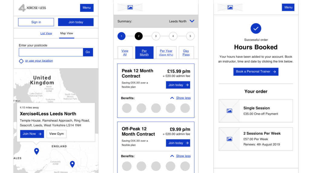
One-stop shop was particularly applicable to the account area we created. I worked with sales, support, and finance teams at Xercise4less to develop user flows that would allow members to take control of their flexible plans, changing everything from payments to add-ons. We were even able to integrate the feature members valued the most: temporarily freezing their subscription.
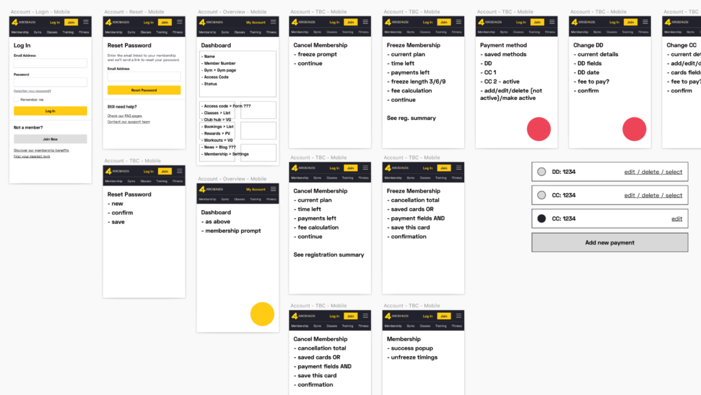
With so many actions having considerable effects, I made transparency a key principle for these screens, using comparisons and totalisers to help users made an informed decision. Depending on the account status, there was a complex matrix of states to design, requiring clear messaging to explain any restrictions and draw users towards resolutions.


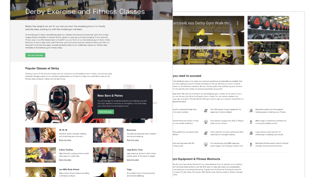
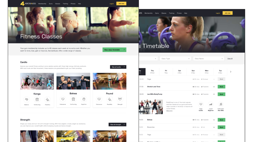
Xercise4less had identified their group classes as a value-add that supported retention. From speaking to members, we knew this was because of the friendly social setting and consistent fitness results. It was a priority to make the service easier to access, bringing it out of the app and onto the web, integrating bookings with the new account area.

I redesigned the entire section to provide a simple journey from discovering a class to reserving a space. At each step, I elevated information that would address queries like “Will this help my goals?”, “Does it fit my schedule?”, and “Is there space for my friends?”. Developing UI patterns for the classes, particularly the calendars, was helped by researching competitor solutions and wider best practice.

Throughout the project, I presented work to Xercise4less twice a week over Zoom. At first, I was setting up an Invision prototype with polished designs, using the comment tool to record feedback. However, I didn’t always have something ready to share, and the export process was an expanding overhead.
So I started to walk the team through my Sketch artboards instead. This allowed the session to pivot from just feedback to collaboration. I mixed screenshots, written notes, and premade components to quickly explore alternative ideas together. These could still be turned into simple flow prototypes with the linking tool.
Outcomes
Whichever way the new site was judged, it far outperformed the broken experience it replaced. With a 30% increase in page speed, and simplified task flows, users started to engage with more of the marketing content and go on to purchase memberships at a higher rate.
- -81% bounce rate
- +75% dwell time
- -51% checkout abandonment
In the fortnight immediately after launch, Xercise4Less saw daily registrations peak above 1,000 not once, but twice. This was the first time in 18 months that such a volume had been achieved.
Takeaways
- Personas are better delineated by a unique circumstance or need, than by basic demographic categories that don’t tell the story.
- Sharing rough work was daunting, but the benefit was gaining alignment sooner and at a much lower costs to the project.
- Combining Zoom, Invision, and Abstract meant we were able to invite the client directly into the design process.
- Design system are most beneficial at scale, allowing creativity to focus on niche problems instead of reinventing common patterns.